[design]
Why Planner looks the way it does

A planner should lower the volume of your day, not add to it.
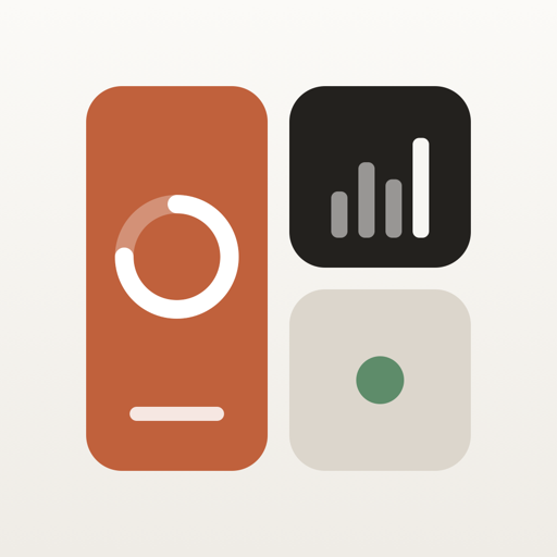
Planner is built around a style we call Editorial Calm: warm paper, a handful of colours taken straight from the app icon, and type that stays out of the way.
Four colours, one job each
- Terracotta for what is happening now.
- Charcoal for numbers and progress.
- Sand for rest and empty space.
- Sage for habits and things you have done.
Every widget is a simple object you can recognise from across the room, which matters when Planner is running on a display on your desk.
[more from the journal]


[product]
Display and Sleep: Planner for your desk and your nightstand
An ambient desk display and a dim bedside clock, built into Planner.